Hand someone a paper card and you’re asking them to be careful with it.
Hand them a metal card and you’re telling them you won’t be.
That difference sounds dramatic, but it’s real. A business card is a tiny, weird piece of branding theater: a few seconds of attention, a quick exchange of objects, and then your name either vanishes into a pocket abyss… or it sticks.
Paper feels like “nice to meet you.” Metal feels like “remember me.”
Here’s the thing: people judge objects before they judge content. Weight, temperature, edge finish, surface texture those cues fire instantly, long before anyone reads your title.
Metal Kards win that sensory race.
You feel it. You flip it over. You angle it under light because it demands that extra second of inspection. Paper almost never gets that courtesy unless it’s unusually designed or unusually expensive (and even then, it’s still paper).
Now, this won’t apply to everyone, but in rooms where status and competence are being assessed quickly, agency pitches, investor chats, executive introductions, metal has an unfair advantage because it doesn’t look disposable.
The “premium” effect isn’t magic. It’s physics and manufacturing.
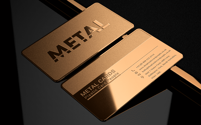
Metal cards feel premium because they’re manufactured like products, not printed like stationery.
A few specifics that matter more than most people realize:
– Mass + rigidity: a card that resists bending signals permanence. It’s dumb, but our brains treat sturdiness as credibility.
– Edge quality: a precision-cut edge (especially beveled) reads as high-tolerance manufacturing. Sloppy corners read as cheap.
– Surface engineering: brushed vs. polished vs. matte isn’t aesthetic fluff; it changes fingerprint visibility, glare, and perceived price point.
I’ve seen beautifully designed paper cards get dismissed because they feel like every other card. Meanwhile, a minimally designed metal card, clean type, small logo, perfect spacing, gets pocketed like it matters.
One-line truth:
Metal turns a business card into an object.
Durability: metal doesn’t “last longer.” It survives different failure modes.
Paper business cards fail in predictable ways: moisture, creasing, edge fray, ink rub, lamination peel. If someone carries it for a week, it’s already aging.
Metal fails differently. It can scratch, sure. Coatings can wear. Cheap finishes can chip if the vendor cuts corners. But the card generally remains legible, intact, and presentable under the kind of abuse that turns paper into trash.
A technical breakdown (quick, not exhaustive):
– Moisture resistance: metal shrugs off humidity and wet pockets; paper absorbs and warps.
– Structural memory: metal returns to shape better than cardstock once bent slightly; paper creases and stays creased.
– Graphic permanence: etching/engraving outlasts printing because the information is physically cut into the surface.
If you’re handing out cards at conferences, site visits, bars, outdoor events, metal is just less fragile. That’s the whole story.
Tactile impact: weight is a credibility cue (yes, really)
People don’t like admitting this, but “heavier” often translates to “more valuable.” Marketing researchers have found that heavier objects can increase perceived importance and seriousness in judgment tasks. One frequently cited study is Jostmann, Lakens & Schubert (2009), Psychological Science, which showed that physical weight influenced perceptions of importance and seriousness.
No, a metal card won’t close a deal on its own. But it absolutely changes the emotional framing of the exchange. You’re not just passing information; you’re creating a micro-experience.
Look, I’ve watched people do the same thing over and over: they receive a metal card, pause, rub the surface with their thumb, tilt it, then ask where it was made. That’s time you don’t get with paper.
Hot take: etched metal cards make you look more accountable
If your card is etched into metal, you’re implying permanence. That can sound abstract until you’ve been in a procurement-heavy or compliance-heavy environment where “we don’t disappear after the invoice clears” is the subtext everyone wants.
Etched metal signals:
– you invest in tools that last
– you care about production quality
– you’re comfortable being remembered
It also signals something else: you’re not optimizing for cheap volume. You’re optimizing for impact per interaction. In high-value services, consulting, legal, finance, high-end real estate, enterprise sales, that’s usually the right bet.
Customization that actually matters (not the gimmicks)
You can do a lot with metal. Too much, sometimes.
The best customization choices are the ones that improve readability, handling, and recognition, not the ones that turn the card into a novelty.
A few options that consistently perform well:
Finishes
– Brushed metal: low glare, hides fingerprints, reads “professional”
– Matte black (PVD/anodized): modern, minimal, but text contrast must be tested
– Polished/gloss: luxury-coded, but glare can kill legibility under bright lights
Marking methods
– Laser engraving: sharp detail, great for logos and small type
– Chemical etching: tactile depth, durable, premium feel
– Infilled enamel: strong color pop, but introduces a wear point if done poorly
(And please test your font at actual size. I don’t care how beautiful it looks on a monitor.)
Where metal cards really shine: the “high-stakes small talk” zones
Metal cards are overkill for some industries. For others, they’re almost a cheat code.
They play best when:
– you meet people briefly and need fast recall later
– you operate in premium categories where pricing is already a filter
– you’re often one of many similar vendors in the room
Corporate lobbies. Executive briefings. Private events. Sponsor dinners. Boardroom introductions where everyone’s wearing the same navy suit and saying the same three competent sentences.
Paper gets lost in that crowd. Metal interrupts it.
Cost vs. value (and the part people avoid saying out loud)
Metal cards cost more. Obviously.
The better question: what does one strong conversation cost you if you fail to get the follow-up? If you sell high-ticket services, one saved relationship can pay for years of premium cards.
Still, don’t get carried away. I’ve seen teams order elaborate metal cards, then hesitate to hand them out because they feel “too expensive.” That’s a self-inflicted wound.
A practical approach I recommend:
– Use metal for executives, closers, client-facing leads, top-tier events
– Use high-quality paper or standard cards for broad distribution
– Keep the design system consistent so both feel like the same brand family
Choosing the right finish: quick field-tested guidance
Ask yourself two questions: will it be read quickly, and will it look good after being handled?
Some rules I like (not universal, but reliable):
– If you work in conservative environments, go brushed steel + deep engraving.
– If your brand is luxury-forward, consider brass/gold tone but keep typography restrained.
– If you insist on matte black, use high-contrast engraving and avoid thin strokes.
– If you’re adding color, limit it. One accent is usually enough. Two is risky. Three is chaos.
Request samples. Put them in a pocket for a week. Hand them to someone who doesn’t care about your design feelings and ask: “Could you read this in bad light?”
Beveled edges + etched logos = memory anchors
A bevel is not just decoration. It’s a light-catching identifier. When the card turns in someone’s hand, the edge flashes and the object becomes easier to recognize later.
Etched logos do something similar, but subtler: they create micro-shadow and tactile depth that people register even when they’re not paying attention. That’s the whole game with recall, your card has to survive distraction.
Busy patterns don’t help. High precision does.
Switching from paper to metal without making it weird
If you’re rolling metal cards out across a company, treat it like a brand system change, not a print order.
A clean rollout usually looks like:
1) pilot with a small group (client-facing roles)
2) measure reactions in the real world (not internal opinions)
3) lock specs and vendors so quality doesn’t drift
4) train the team on when to use them (because yes, timing matters)
Common pitfalls I’ve watched companies stumble into:
– choosing a finish that photographs well but reads poorly in person
– over-designing (too many effects, not enough hierarchy)
– inconsistent batches because vendor tolerances weren’t documented
– ordering “premium” and then rationing cards like they’re collectibles
Metal cards work best when they’re used confidently, not guarded.
One last thought, slightly opinionated:
If your work is premium, your first touch should be, too. Paper can do that sometimes. Metal does it almost automatically.